Hi everyone... I started a new thread that last one was full of blabing.
thank you Behold the void, I really apreciate your help.
what does everyone think, anything needs to be improved?.


Hi everyone... I started a new thread that last one was full of blabing.
thank you Behold the void, I really apreciate your help.
what does everyone think, anything needs to be improved?.
Last edited by Owen Macwere; 07-26-2006 at 09:38 AM.

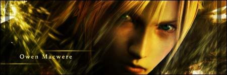
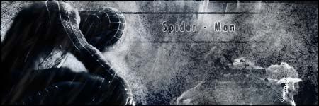
They're all full of awesome brushes and the way they're placed is great. I like the spiderman sig out of all them more but they're all pretty good. Great work.


nah, the cloud one is the best, i think that the second is perhaps a little too busy. it might be just me, but i think the writing over her image makes it look a little odd. as for the others they're all great, as per usual!
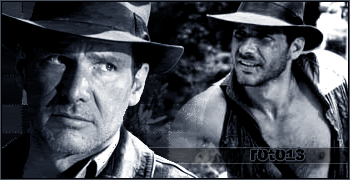
The Cloud one is terrific, great use of colors. I agree the text looks odd on the girls face in #2, and the left side of her face does as well because it's red. Otherwise # 2 is a nice sig. I like #3, but I think it would've looked better as mostly one color instead of the blueish green in the middle.
Overall good job

I was expecting the "quitting" thing to last at least a full day.
No roto, it wont last a full day, it would last in few seconds. I will go on and no no one ever can stop me from making sigs, because I know and many others do, I am stealing no ones idea's.
And I wish those who called me a thief to stop coming to my topic.
thanks Raebus, LAFOD and GooeyToast, I will work more on improving the work. thanks people.
Last edited by Owen Macwere; 07-26-2006 at 06:48 PM.

Its really pretty
warriorboy && battlingbard.
Well, that's crap, but whatever.Originally Posted by Owen Macwere
Get out of here Roto... stop ruining every thread I make, or the warn bottom will look too fancy to be clicked ...:rolleyes2
Whatever. I thought you might have grown up a bit after our chat, but you're the same as ever. Have fun alienating all of the other sig makers.
I agree, he's not ruining your thread Owen. You can still post sigs and get the same effect from people. Thats the point of the thread right?
Lol Kyono buddy.
Genji, stop your childish arguing... if people think I am stealing they wont have said that my sigs are good or have used them.. good luch to you.
but I wish you and Roto to get your butts outa here.
I fail to see how that was childish. If anyone is acting childish in here, it is you. You don't have to listen to us, you know.
those sigs are really good. You've improved greatly. the spiderman one is my fav. Looks very evil
seriously guys, stop fighting over the sigs. If owen wants to make his sigs that way then let him. If you got something against him then use PM. No need to mess up his thread like this.
 Posting Permissions