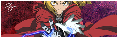
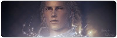
That's a cool sig, I have been looking for these renders for so long.
cool work as usual.
I <3 you Polaris~Antratica forum~ You know you want to join =p
That one is very cool! Your best thus far. I'd just say that you should perhaps variate with the font of your text.
lol ill make sure to. I just really like that font :mog:
Made by me
It's good font. I like it too. But imagine if some of the members dont like it, and they gotta see it everytime you make a sig. Theyll think less of the sig overall. If you have a variety of different fonts, you should please all people.
I make sigs for people, thats my aim. But if your a type that makes sigs for yourself, than thats cool, keep the font.
Yeah when i make sigs for other people i usually use a different different.
Hows that?
Made by me
Lmao. Firstly i'd like to say that that is one of the funniest typos ive seen yet.
Now for the sig. It's very well blended, and you've gotten a great render which takes up JUST enough of the signature, so that you can have ONE render. (if that makes sense)
The pinstrip border makes a huge difference. Positivley.
that's not a typo.. that's the font :P
looks nice.. but where is jack of blades mask? he isnt 100% evil xD
That's a cool sig, I really like it.And the render is cool as well, good work.
But I guess that sharpening the render a bit more would make it stand out better, I like the sig, though.
I <3 you Polaris~Antratica forum~ You know you want to join =p
hahaha no that was a typo. I was typing that around 3 AM so i was pretty tired. Sorry about that.
Made by me
oh <_< lol hehe i get loads of fonts like that but i never use them because they looks like typos so i thought that it was just the font
I love your work, its amazing! C4 renders are great to use, but there arent many around, I use DevinatArt and they only have a few.
well www.planetrenders.net has a bunch if your looking.
Made by me