New sig, 2 version. Just different text. Personally i like the latter.


New sig, 2 version. Just different text. Personally i like the latter.
Made by me
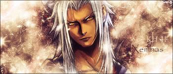
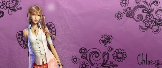
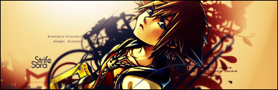
It looks gorgeous!!! the sora render looks great with the vectors behind him. However, i think it got a little empty towards the left end of the sig. Something done with the path tool may have improved it. Or maybe not because it might look too busy. gah..i'm just rambling. GJ!!
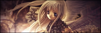
i like the second one better because the text is a little different. It's not all jammed together like the first one but rather separated to form a different look. I like that change in text.
comments?

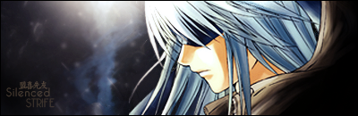
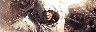
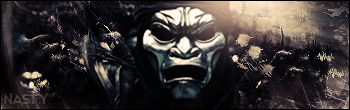
Well yeah..it's nice..simple and nice.The BG is nice.
想要對妳說的 不敢說的愛

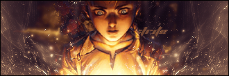
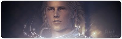
Nice deepth, liking the BG and the text. GJ.
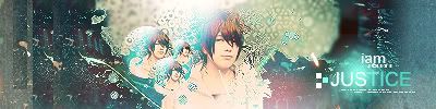
thanks, japanese text says Riku just incase anyone was wondering.
I like the colours in the sora sig they appeal to me. And a good idea with the light at the top leftish.
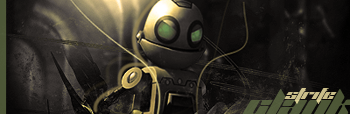
My thread
-3 time sigmaker challenge Winner
Too tall. Maximum signature height is 250px. Please read the Signature rules and feel free to PM a mod/admin if you do not understand them. -Rantzien
most recent
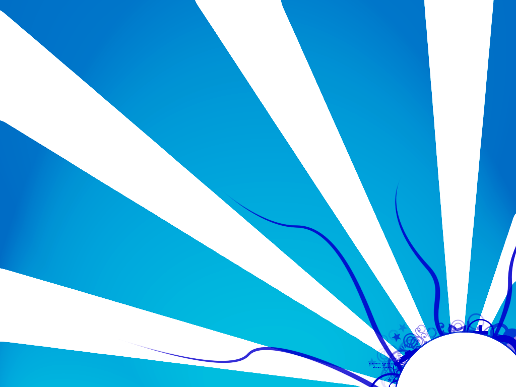
my first Wallpaper, thoughts?
Is that pen tool or lines with the 'share' filter?. looks really cool, the idea is simple but hold a good taste, NJ.

That is so cool, I love it!
♥
it really stands out, sorta hypnotizes me for a bit lol
My thread
-3 time sigmaker challenge Winner
Too tall. Maximum signature height is 250px. Please read the Signature rules and feel free to PM a mod/admin if you do not understand them. -Rantzien
Thanks guys! Went back to sigs, here are some new ones.
comments are welcome.
 Posting Permissions

 Reply With Quote