Looks like Freya.Originally Posted by Miriel


Looks like Freya.
Yup. Freya. I don't like Freya.

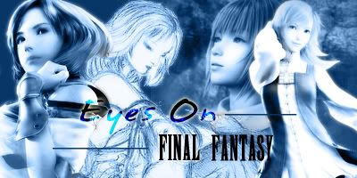
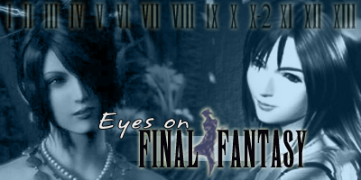
rubah's would be great if the text was more stylishly done, I don't like how far the "Eyes On" is above the Final Fantasy on the first one, and a bit of a bevel on the text would be nice. For #2, get rid of the slanted "Eyes On" text and do an outer glow and bevel.
After scrolling through this entire thread and looking at all of the sigs, my two cents are that 95% of them are too busy. I don't know why everyone feels that if there's any empty space that it has to be filled. I'm a firm believer in "Simple is elegant." So something like rubah's or Azar's modification are clean and easy on the eyes. I also tend to like banners that are simple yet creative and clever in their design.
Also, the lack of pre-FFVII characters in a lot of these banners saddens me.
Next try. Any thoughts?
Also I am wondering if my text should be just a little larger on the first one?
[edit]...and it seemed to be a little to lavender.
before
after
@Bantam: That would probably be because it's really hard to get good images of pre FFVII. You better know how to screen capture.
Last edited by Arrianna; 09-05-2006 at 10:35 PM.
Ooooh, I might have a go with some of those.
Ah, perfection.


People seem to be starting to move away from 'images that would make good sigs' and moving towards 'images that would make good banners' which is a good thing.
I like that a lot of people are progressing their stuff but I'm going to quote something I just said in chat to someone else in relation to this thread.
Of course, sk and I aren't very good with Photoshop yet so our one I wouldn't vote for at all - but the thought of doing something that doesn't use the same style that a lot (if not most of) other people are using is always good.My only advice would be: Stop thinking in the way of putting three images side-by-side, a-bunch-of-faces, one-image-in-each-corner... and start thinking differently, like how Leeza has one image (more than just a face) covering over 50% of the current banner but Vivi (also not just a face) only a third, and how sk & I had a few images all 'pointing out' from the center of the image instead of side-by-side or one-in-each-corner like everyone else does.
Bow before the mighty Javoo!
Oh yeah, I noticed that a lot of them are full of female characters, too. I don't know if that's good or bad or anything, but it does strike me as a bit odd.
Bow before the mighty Javoo!
I like it Arrianna, but are we allowed to use fanart? I've been under the impression that it was better to stick with Squareart or game scenes. 3=
Oh and Square just does such a better job at female chars xD I mean, what male chars are actually good? Few. *throws Cloud and Squall and Zidane and etc down the toilet* :3
Wat
is
going
on
wtf
rawr
I believe they are all Square released art. If there is a specific image you have a question on let me know and I can give you the source.
Here's my fourth attempt. Haha.
Apparently, I have been declared banished.
A kinda simpler one.
It looks like it's fanart, but it's definitely official, mojo
Oh, and mojo, I liked how it was out of the box!
I like that one, emma!
A thought-- What's the real point in sticking to less than 400 or whatever pixels? A long banner would look sorta neat stretched out. I dunno I'll actually use that though so I'll throw it out to you guys.
b0b, what's the difference between "good on sigs" and "good on banners"? They're more or less the same thing, except more people have to look at it for a longer time
 Posting Permissions


 Reply With Quote
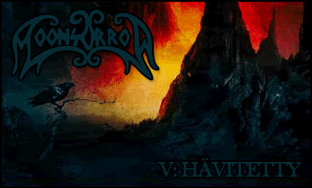


 )
)