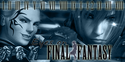
Jess (1)
The shade of blue is a little off, I can't quite place how. It almost doesn't seem blue... keep checking your hues until you find the right one for EoFF Classic. I like your left image, I like your central image, I'm not entirely sure on your right image but we'll see. Don't colour over the text, though - make the text stand out from the image by making it empty of hue and you'll improve this banner by well over 100%.
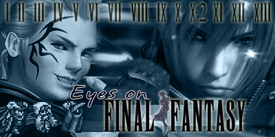
Jess (2)
Pretty.

Could use a little darkening but that might lose it's 'crystal-clear' look. This may just not be suited to EoFF Classic, I don't know... four images seems a bit much to me, and I don't like angled eye pictures, although of all the angled eye pictures, I guess this one
is the better one.

I'd be interested to see what it would look like if you had an eye image facing straight forward in place of the current eye, sort of like how Mulley (Bantam) did his eye-banner (linked far above in this post).


Originally Posted by Agent Proto


 Reply With Quote


 Sorry I'm not much help.