Page 5 of 32 FirstFirst 12345678910111525 ... LastLast
Results 61 to 75 of 473

Thread: EoFF Classic Banner Competition 2006

  1. #61
    Banished Ace Recognized Member Agent Proto's Avatar
    Join Date
    Aug 2000
    Location
    Root Beer Forum
    Posts
    15,629
    Articles
    111
    Blog Entries
    70
    Contributions
    • Former Cid's Knight

    Default


    Just giving it a shot. I know I have no chance to going far.

    Apparently, I have been declared banished.

  2. #62
    Posts Occur in Real Time edczxcvbnm's Avatar
    Join Date
    Aug 2000
    Location
    The World
    Posts
    7,920

    Default

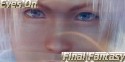
    I submit to you...the only banner that really matters.

    Attached Images Attached Images

  3. #63
    Those...eyebrows... Recognized Member XxSephirothxX's Avatar
    Join Date
    Sep 2004
    Location
    SFCA
    Posts
    7,102
    Articles
    181
    Contributions
    • Former Senior Site Staff
    • Former Cid's Knight
    • Former Site Staff

    Default

    Quote Originally Posted by DK View Post


    needs work, but you get the idea

    I'm debating as to whether it needs something on the background or not, I can't make my mind up
    Dan, if you gave this the classic blue tint and made it absolutely bustling with overlapping 2D sprites (think Paper Mario 2) it'd be awesome, I think.

  4. #64
    Jäästä Syntynyt GooeyToast's Avatar
    Join Date
    Dec 2004
    Location
    Uzbekistan
    Posts
    2,397

    Default

    Here's a few variations on an entry:
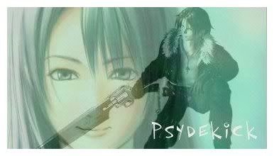


  5. #65
    Quack Shlup's Avatar
    Join Date
    Aug 2000
    Location
    California
    Posts
    34,993
    Articles
    14
    Blog Entries
    37
    Contributions
    • Former Administrator
    • Former Cid's Knight

    Default

    Proto:

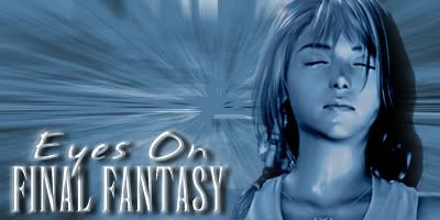
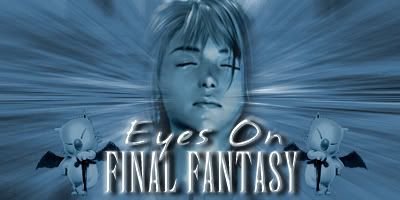
    The text in front of whats-her-name's nose is distracting, and her face takes up too much of the image.
    The background on "Final Fantasy" is distracting--maybe make it transparent?
    The chocobo belly shouldn't be in front of Zell's face.
    WTF is that thing right in the middle of the picture?

  6. #66
    Ominous Wanderer Tech Admin Samuraid's Avatar
    Join Date
    Oct 2001
    Posts
    5,522

    Default

    Rye: The right side of your banner is PERFECT. The left side is a little hard to make out at first and may be a bit too busy. Just my 2 cents. Still well made.

  7. #67
    This is England
    Papa Waigo
    Recognized Member DK's Avatar
    Join Date
    May 2000
    Location
    All the time in Sunny Beach
    Posts
    7,921
    Articles
    25
    Contributions
    • Hosted Eyes on You
    • Former Site Staff

    Default

    Dan, if you gave this the classic blue tint and made it absolutely bustling with overlapping 2D sprites (think Paper Mario 2) it'd be awesome, I think.
    That's originally what I was going to go for but then there was the whole lack of being arsed. I'll give it a shot at some point, though.

  8. #68
    (。◕‿‿◕。) Recognized Member Jojee's Avatar
    Join Date
    Dec 1999
    Posts
    9,611
    Contributions
    • Former Cid's Knight

    Default Dare to be Different?

    Olette: getting there XDD

    Attached Images Attached Images


    Wat
    is
    going
    on
    wtf
    rawr

  9. #69
    Score: 0 out of 2 Dignified Pauper's Avatar
    Join Date
    May 2001
    Location
    Ohio
    Posts
    6,035

    Default

    If Doctor Unne does not win, it will be a travesty.

    IF Bipper doesn't win, then I recommend it for BoB's Simplified Style.


  10. #70
    Newbie Administrator Loony BoB's Avatar
    Join Date
    Aug 2000
    Posts
    52,435
    Articles
    53
    Blog Entries
    19

    FFXIV Character

    Loony Bob (Twintania)

    Default

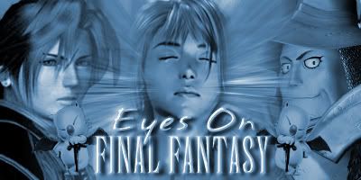
    Rye's, Zeldy's, Proto's are my faves so far, although other people such as Gooey and Olette have ones that could be improved into something quite interesting. Olette - you really do need to focus more on the text. What is meant to stand out in the image is the fact that this is a banner for Eyes on Final Fantasy, not the FF images surrounding it. Make it stand out a little more. This did wonders for Rye's image - although I still agree with Samuraid about it being a bit busy, particularly with the left hand side... in fact, I've never played FFIX and I think that the left hand side pic is an FFIX one and I really can't make it out easily at all because I haven't played that game - maybe you should go for an image that is easier to make out or a bit more simple?

    With regards to Zeldy, can you show me what that latest one would look like if the text was moved to the bottom right? Just curious.

    Keep it up, folks. Got loads of time yet, and it's great to see how open people are to the feedback they're getting because that's exactly how you'll get your banner into a winner.
    Bow before the mighty Javoo!

  11. #71
    get mad Zeldy's Avatar
    Join Date
    Jan 2005
    Location
    Manchester, UK
    Posts
    7,706

    FFXIV Character

    Linkle Grey (Sargatanas)

    Default

    Fraid' I can't do that BoB, I never saved it as a .pdf. Could someone suggest which characters I SHOULD use instead of "Use others". Ive only ever played 2 Final Fantasy games >_>

  12. #72
    Viva La Resistance Psydekick's Avatar
    Join Date
    Sep 2005
    Location
    In like a field like with like people
    Posts
    2,818

    Default


    I cant make banners Does anyone know how you get rid of an images background on Paint Shop Pro 7?

  13. #73
    Score: 0 out of 2 Dignified Pauper's Avatar
    Join Date
    May 2001
    Location
    Ohio
    Posts
    6,035

    Default

    thanks for commenting on mine BawB! You must think it's terrible.


    *cries in a corner*

  14. #74
    dizzy up the girl Recognized Member Rye's Avatar
    Join Date
    Dec 2002
    Location
    a tiny boot
    Posts
    24,891
    Articles
    4
    Blog Entries
    3
    Contributions
    • Hosted Eyes on You
    • Former Cid's Knight

    Default

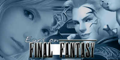
    Thanks for your comments, guys! I tried making Freya a bit softer and the background around her lighter, to make the left side less busy. I'd rather not replace Freya unless I have to, because nothing else fits good in that area and I'd really rather not put another feathered image there. What do you guys think?

    <a href="http://photobucket.com" target="_blank">Photobucket - Video and Image Hosting</a>


  15. #75
    Viva La Resistance Psydekick's Avatar
    Join Date
    Sep 2005
    Location
    In like a field like with like people
    Posts
    2,818

    Default

    Very nice Rye, much better than the last one

Posting Permissions

  • You may not post new threads
  • You may not post replies
  • You may not post attachments
  • You may not edit your posts
  •