
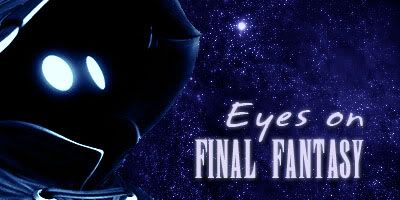
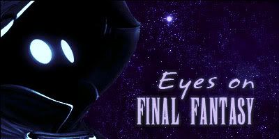
Resha, would you be able to do yours with 'Final Fantasy' in a font similar to what the others use? If so I would like it the best.


Resha, would you be able to do yours with 'Final Fantasy' in a font similar to what the others use? If so I would like it the best.
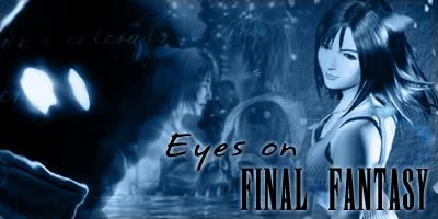
Proud to be the Unofficial Secret Illegal Enforcer of Eyes on Final Fantasy!
When I grow up, I want to go toBovineTrump University! - Ralph Wiggum
Dude, this is my 7th attempt. D:
Apparently, I have been declared banished.
In case anyone needed the default Final Fantasy font. Rather useless unless you are spelling out Final Fantasy in all caps, though.
Well said, I love the EoFF classic and besides Ed's techno color luv luvness I will only ever use that theme.Originally Posted by Miriel


Not to mention the brown skin is ugly as sin.
And poo.

nice
Considering the classic style is not exactly a high-contrast glowing blue, beefing it up more than it is doesn't seem to make sense. I think most of these banners have too much contrast, but maybe that's what everybody likes now.
I have to put my say in. The Vivi one DK redid is excellent. It seems when we try to include too many characters things get cluttered or just don't look as nice. It'd be nice for some generalization on the characters if you want to represent the series as a whole. What better than the simple black mage, like Vivi?
That's the most ridiculous load of crap I've ever heard. Go back to Europe, Frenchie!
The eye in Bantam's banner looks like a Kilrathi spaceship. Furballs!
...
Blasphemy!!
I tried it, Del!And many thanks to HMAU, who put up the font!
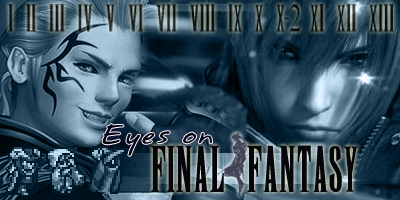
Am I blind or is Squall looking as though he is an old brat?.
Good touch Bantam.
I can't take credit for the Squall edit, I found that when I was searching for other images. Still, it made me chuckle so I thought I'd use it.
 Posting Permissions


 Reply With Quote


