
I very much like this last one. It is really neat. And I like the text alot, keep it up.


I very much like this last one. It is really neat. And I like the text alot, keep it up.
Its nice to see your work improve! I am a HUGE Venom fan and i really like the render on the right of the sig. The first one i find odd but cool Zidane, Abom and the swans what a combo
My thread
-3 time sigmaker challenge Winner
Too tall. Maximum signature height is 250px. Please read the Signature rules and feel free to PM a mod/admin if you do not understand them. -Rantzien


You know swans!? How mad. Yeh I'm a gigantic swans fan, going to the game on friday! So psyched.
Anyway yeh I've browsed through your thread and you're very good, so it's nice to get some compliments from someone of you're level.
Cheers.

Your last one is good, and I have to say, a lot better then your first few. Keep it up, you can defintely see an improvement!
♪ wheee!
:hello: WHAT HAPPENED TO THE HELLO KITTY SMILEY :hello:
Thanks Innocent.
What's going on? Some of my signature's are dissapearing from the forum. The signature 1/3 on my first post is gone, and my sonic one.
huh?
Very nice, I don't know about the two different colors of text, I probably would have stuck with one color for this sig. But doesn't hurt it any, and it gives a particular impression that wouldn't be there with only one color.Originally Posted by Torak

As for some disappearing.... no clue.

STILL Updating the anime list. . . I didn't think I was that much of an anime freak! I don't even want to consider updating the manga list!
Not bad, not bad. Keep practising.
Ah they've returned (sigs).
Thanks Saphire. I've had a busy day today, so I'll make a few more tommorrow.
EDIT-
(3 days later)
Sorry been busy.
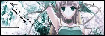
The little quote at the bottom is the name of a song that I like. The flowers reminded me of it.
Aint posted one in ages. Hopefully this will keep my huge fanbase happy.
Last edited by Torak; 09-23-2006 at 04:17 PM.
That's a nice sig Torak.I'd only say it needs some blending, but overall. Nice job.
Your last one is nice! But I agree with Owen, maybe you could've made the picture blend with the background more. But still, a very good job.
♪ wheee!
:hello: WHAT HAPPENED TO THE HELLO KITTY SMILEY :hello:
 Posting Permissions


 Reply With Quote
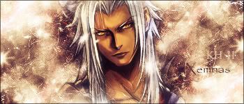
 - Used soem sortve...hmm wats the word, not cryptic. Cryptic will do. I used some cryptic kindve runes to emphasize the "Ancientness" of the tauren. Chucked some stars in the corners, used two different coloured texts and wa la.