I love the first one of Sora and Kairi, it's sooo cute! The paper clip on it seems a little off, however. Like, it's kind of weird how it fades off, or something.
The second one is lovely! I love the rain animation, which reminds me, I have to learn to do that ... xD
And the third one - did you smudge on it? I don't know if 'smudge' is the word in GIMP, but same difference ... if so, you did a good job, if you didn't, it's still cool!! I prefer the first 'version' though.

 Reply With Quote

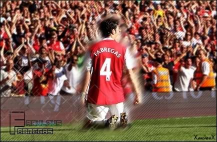
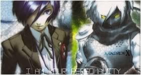
 ...all hail Goldenboko!
 sry but we all know you can do better... the render however is awesome...