I don't like the two guys kissing
But other than that... the banners are lovely!
Now.. about the avy's, the Rinoa one i don't mind.. as you put some text ontop of the other text, good work ^^


I don't like the two guys kissing
But other than that... the banners are lovely!
Now.. about the avy's, the Rinoa one i don't mind.. as you put some text ontop of the other text, good work ^^
I really agree...Originally Posted by -=Squall-Leonhart=-

Anyway..those sigs are great..the first one the render doesnt seem to blend in well into the sig..the 3rd one is the nicest of all because it's really nice as a whole sig..nice one.
想要對妳說的 不敢說的愛
If it was two girls kissing you'd love
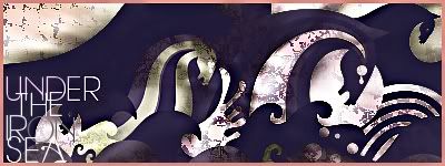
Anyway just made this! I've been trying a new style it took me half and hour but it could come out better I think!
For some reasons I prefer girl and boy kissing..
The text in the sig is a little hard to read..but the text blends quite ok with the sig..and maybe you make it in a rush?Because it looks kinda..anyway only my opinion is that the border is too thick..just my opinion..But the waves are nice..Good Luck.
想要對妳說的 不敢說的愛
i like it alot polaris, it's a new original style and really nice
about the border, i have to say that i disagree with XandrewX, i think the border is really simple and it fits the sig perfectly,
but i do have one minor comment... i think the sig is way to edgy, you should have blurred it, doesn't have to be much just like, perhaps gaussian blur with the ratio of 1,00 just to make it less edgy... but it's still a great sig polaris
EDIT: Btw, i like the text and the font is awesome... I have to find better fonts:rolleyes2

=====>Check out my sigs!<=====
It's keane's fontIf you see there 'Under The Iron Sea' font it'll be that font!
Oh and I used Blur but motion blur ^^" I can't wait to develop this style and make new tuts
ok cool...
but you use motion blur? i can't see it...
=====>Check out my sigs!<=====

Oh, wow! Totally different and super cool! I loooove the grungey-ness of it because it totally reminds me of the song "atlantic".
Although, Leaving So Soon is my favorite song.
Waa slow down i cant keep up!
I like your latest one alot its good to branch out and try something new. 1 thing though im not keen on the border but thats only minor. Id like to see more of that style u never know what ya gunna get!
My thread
-3 time sigmaker challenge Winner
Too tall. Maximum signature height is 250px. Please read the Signature rules and feel free to PM a mod/admin if you do not understand them. -Rantzien
I like it.. it's verry good! reminds me of wall pictures because o0f the grunge ( this is in a good way! )
why do people think the border is bad???
I think it's really nice and simple and totally suits the signature...sure it's not "WOW FREAKING AWESOME!!!!" but it really fits in good with the sig...
=====>Check out my sigs!<=====
I just said that the border is somehow too thick that's all..Every sig I created had borders too...just don't be too special with the borders because..sometimes something must be kept simple..just my opinion though...
想要對妳說的 不敢說的愛
Borders are completely overrated. I like ti the way it is.
Well different people see things in different prespective
想要對妳說的 不敢說的愛
yeah i guess everyone has their own opinions... let's just leave the topic and let polaris post her new sigs
=====>Check out my sigs!<=====
 Posting Permissions