The latest one is nice..but there's a place where it's kinda bright..should add a lil yellow to cover it I guess..well just my lame opinion anyway good job.


The latest one is nice..but there's a place where it's kinda bright..should add a lil yellow to cover it I guess..well just my lame opinion anyway good job.
想要對妳說的 不敢說的愛
lame
made from scratch
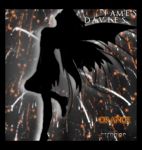
it's really nice although i don't like the black around the pic the borderlike stuff... it's way too thick... although the pic itself is amazing... although the "on" and "steroids" text could be better, the "orange" is good thoughreally good considering it's all from scratch...
=====>Check out my sigs!<=====
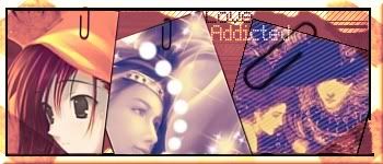
Two new ones: trying a few styles
Thoughts/ comments/ critics and curses??

Cool, I like the the first one the best. Nice paper clip thingies.
placeholder_text.jpeg
Er..well nice sigs..but I feel like the paper clips..your overdoing it.well sorry for stupid comments.
想要對妳說的 不敢說的愛
i love them both
although the text in the first one isn't good...
=====>Check out my sigs!<=====
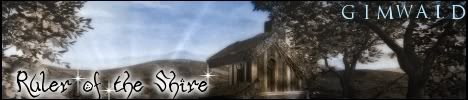
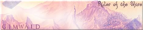
I saw this request and didn't take it but just practised a bit
The guy or girl wanted something like LOTR style and he gave the images so all I havd to do was change colours add text and make the reflect

they're really good polaris
and another thing... the black lines to the left and right in the last sig are a bit weird...
but the sigs are awesome...
=====>Check out my sigs!<=====
I'm trying to work with colours what do you think?

i think this one's really good
=====>Check out my sigs!<=====
Two new ones ^^ I'll make a tutorial with the last onejames started making sigs yesterday with GIMP! ^^" So I need to teach him how to use this powerful program mwahahaha
I love the last one! ^^" It was very simple to make but the result came out perfect!

I'm digging the first one! I'm a big fan of anything that has Scanlines!
The second one is OK, but I have to ask, did you make the stroke a gradient? Because it looks like it fades to transparent at the bottom left corner. (Which I like mind you.) Anyway, keep up the good work
placeholder_text.jpeg
i love them both but my fave is the second one... the text is awesome, i like it in the first one too but the second is a bit better
really nice
=====>Check out my sigs!<=====
Yeah it's nice..can you tell me how you make those lines on the first sig?
想要對妳說的 不敢說的愛
 Posting Permissions