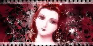
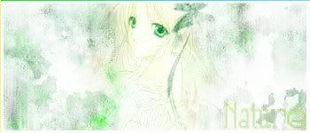
My last one here were horrible so I decided to post some new ones

My last one here were horrible so I decided to post some new ones


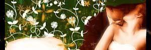
I love the one you made for owen. And the last one is sooo fresh.
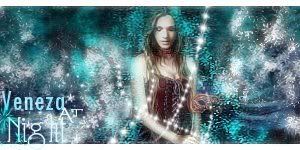
My latest one
I've been trying to use depth at GIMP but it's been hard... almost impossible!
And some buttons


Hiii Polaris! All your latest sigs rock!!!You've really improved and everything you make is awesome, keep at it

=====>Check out my sigs!<=====
Thanks
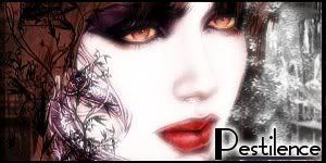
I made two new ones

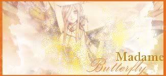
polaris like I said afore you rock and I also still really like the madame butterfly one and the other too
AAAAW I love them both
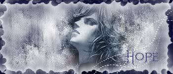
but maybe on the second one you could try to make edges a liiiittle sharper, because right now it's a bit too blended and you can't really make out any contours except for the eyes (although I have to say that that's quite cool too), so maybe try to enhance the edges and make the image a little clearer
they still rock though
=====>Check out my sigs!<=====
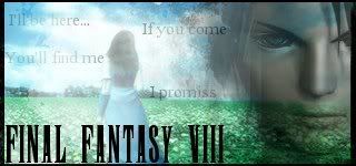
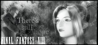
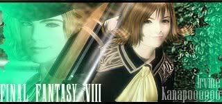
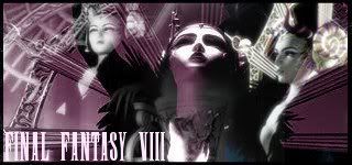
Some ff banners I made... they were not made to have special effects and brushes and those things but to be simple ones!
They are all nice, the only issue I would have is that the borders don't seem to fit some of them. The last two are the best working of them, imo.
Though in the last one your text is on your border(a no-no in my book).

STILL Updating the anime list. . . I didn't think I was that much of an anime freak! I don't even want to consider updating the manga list!
Some new ones

WOOOOW I REEEEEEEALLY LIKE YOUR NEW ONES
The ff sigs are reeeeally nice, The Irvine/Selphie one is my fave, it has the best blending and feeling to it but they're all nice so it doesn't matter
Of the other ones my fave is the Cloud/tifa sig mostly because of the text which is really nice, maybe not because of effects but because it's really emotional. The two in the middle are also really emotional and they really show true emotions and feelings. I love that... It's really hard to accomplish.
The Lulu one is a good contrast to the others and it's very happy, like it's there to cheer you up. It's background suits it really nice
Although just one minor thing... now, I know you weren't going for many effects on the FF sigs, and I get that... But the text looks kinda choppy in many of the sigs... maybe you could try to enhance it somehow... making it a bit softer and not that... edgy
it's not a big deal though...
So keep it up.. I'd love to see more of your work
=====>Check out my sigs!<=====
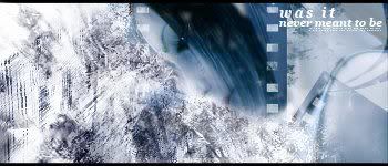
This is definitely one of your better ones in my opinion. The text could possibly be better placed in some cases or at least better colored. Particularly the "?working? through the rain" bit is hard to read. But overall it is quite nice.Originally Posted by Polaris

STILL Updating the anime list. . . I didn't think I was that much of an anime freak! I don't even want to consider updating the manga list!
Roger
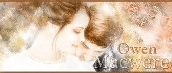
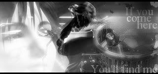
This was my first attempt with the image
Now a few months later here's a new version
Old one
new one

Last edited by Polaris; 06-06-2007 at 08:40 PM.
great improvements
n my eyes... they're perfect
=====>Check out my sigs!<=====

All the FFVIII ones are neat. You really have a great eye for this kind of stuff. Well done.
Str8 Pimpin'
 Posting Permissions