The edea one is rad. I love the brightness!


The edea one is rad. I love the brightness!

try writing something with ETERNITY in it...Originally Posted by Ice Angel


=====>Check out my sigs!<=====
It turned out like this after a few changing
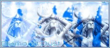
And a Shiva one
Last edited by Polaris; 04-09-2007 at 05:22 PM.

Well I think the first one is good.Clean and simple and nice.The 2nd one is good,but it's kinda like to complicated and too compact...shouldn't have put 3 shivas...one or two will do...or 3 but 2 with lower opacity...Good Job.
想要對妳說的 不敢說的愛
you know i get what xandrewx is trying to say although i kinda like sigs which are busy... it's like more interesting... i think it's more a matter of taste... but i like simple ones too it's those in between that are a bit annoying because you can't really say it's busy nor completely calm... i think that both are good because they are really unique and have a distinct style... but we just have 2 different opinions and there are probably others who don't agree with anyone of us...
=====>Check out my sigs!<=====
heheeh thanks ^^" The idea of the three Shivas was kinda like a monument where there are the statues :rolleyes2 but nevermind... some new ones
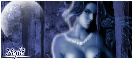
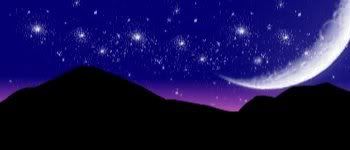
ooooooh the night one is reaaaaaallly awesooomevery nice colors and blending and EVERYTHING... even the text and all the details... one of your best i must say
and the same about your current one... looks great, simple and stylish
=====>Check out my sigs!<=====

I should admire the edges of the second one compared to what other people suffer with the edges of the .gif formate yours are so clean and smooth.
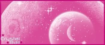
The first have beautiful colors and text. You are doing great, ani. =)
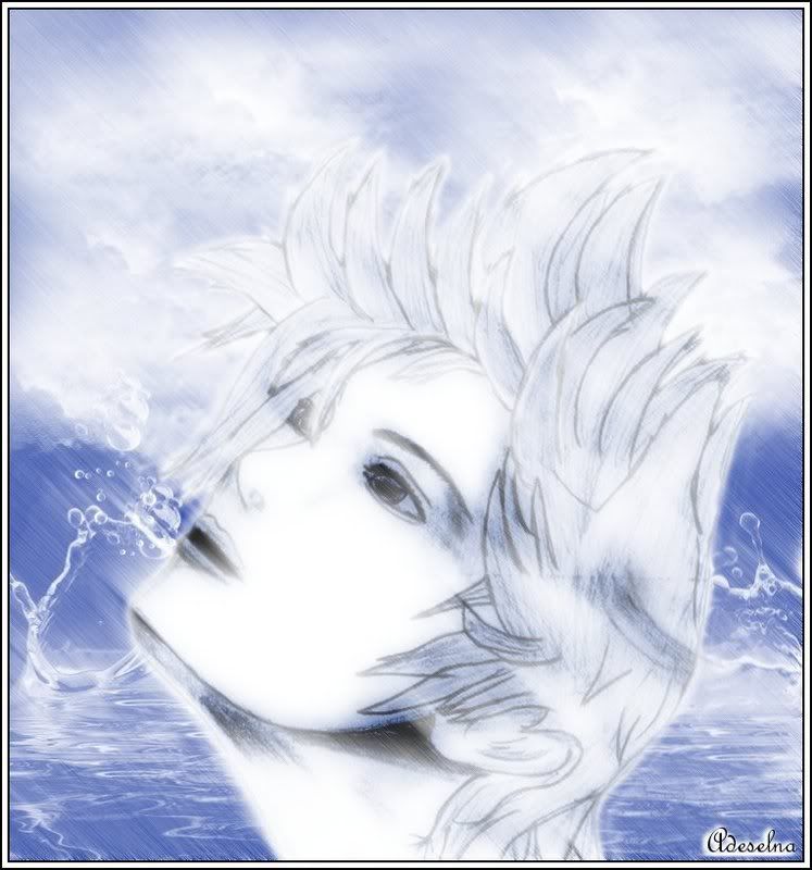
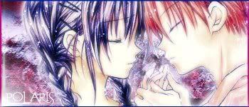
A fail attempt to make something as good as Owen sigs:rolleyes2
I grabbed Owen's draw and kinda wanted to make something more elaborated, but I think I failed
and the original drawing here http://www.deviantart.com/deviation/...e+-in%3Ascraps
whoa... you definitely did NOT FAIL... you made it awesome ice
=====>Check out my sigs!<=====
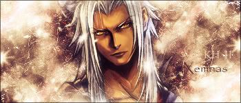
Ana!!! you did amazingly great to that image, way better than anything I tried to do with it. The water and the blending, I love this picture more now.
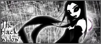
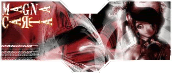
Some new ones...
i like the black widow one even though spiders scare the hell outta meOh and the Shiva one just flat out rocks
My thread
-3 time sigmaker challenge Winner
Too tall. Maximum signature height is 250px. Please read the Signature rules and feel free to PM a mod/admin if you do not understand them. -Rantzien
Doing great ice... keep it up!
the latest are really good ice angel... although i think the last one could use some text but they're not bad at all
=====>Check out my sigs!<=====
 Posting Permissions