
^^" yeah I was going to put Stoner's full name but then I wanted to show it here and I didn't want to put that!
I'm making two websistes one for poems another for graphic design, this is the banner for the graphic one!I didn't make a border because it's to fit on a place so there is no need for one! It'd get pretty weird!
Results 391 to 405 of 506
Thread: Kill Bill and other sigs
-
09-03-2007, 01:17 PM #391

-
09-03-2007, 03:07 PM #392
Geez you suck at this! You'll never be as good as me MUIHIHIHIHIHIHIHIHIHIHIHIHIHIHIHIHIHIHIH
 I'm such a nice student! Wonderful wonderful wonderful ^^
L-O-V-E it.
Ps: You could dedicate one to your brother AND student.... you're mean
-
09-03-2007, 11:22 PM #393
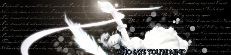
A new one
Azmaria

-
09-03-2007, 11:45 PM #394
Ichiban kirei na sora wo toboyo! Tashika na mirai e Try!
THIS IS MY FAVOURITE ONE!
BEAUUUUUUUUUUUUUTIFUL SO CUTE
AND I LOVE AZMARIA!!! SHE'S PORTUGUESE!!! ^^ YEY
-
09-04-2007, 10:47 PM #395
New one!
DEARS 

-
09-06-2007, 07:44 PM #396
Some new ones!
 People don't like me anymore :weep:


-
09-06-2007, 07:49 PM #397
I love those two and the dears one babe! You're really good! I prefer the bottom one of FMA sigs coz it looks more action packed and interesting!
-
09-06-2007, 10:37 PM #398
I like the first one the most out of the two. As much as I'd would like to say more, your artwork is beyond anyone's advice. I actually have a hard time and even fail when I think of something you could change.
Keep up the good work!
-
09-07-2007, 06:31 AM #399
Yeah..the first one is better in my opinion too.If only the circles's colour matches the Big Circle behind Ed and Al..it'll be nicer that way.
-
09-07-2007, 09:37 AM #400
Yay im lovin all the FMA sigs latley! Flawless as usual
 And how did u get those circles in the sigs brushes?
Oh and zomg u MUST give me the render for the first sig its awsome! pleaseeeeeeeeeeeeeeeeeeeeeeeeeeeeeeeeeeeeeeeeeeeeeeeeeeee
-
09-07-2007, 10:42 AM #401
OMG! The circles are soooo cool! where ever did you find them?!
-
09-07-2007, 02:07 PM #402
I pmed you, guys who wanted the brushes and the images

New ones


Thye're very simple but I was trying contrast!
-
09-07-2007, 02:25 PM #403
Oh, hi Ana. ^^
These last ones are so great -womenly- lol, just one simple advice when making a sig with a light source like these last ones try and make the light come from the right angel. like the third one the light in the image is coming from the bottom left corner while you've placed it in the upper right corner. Keep it up, you've got some potential for angelic looking sigs, I think that's what you're best at. ^^
~NF~
-
09-08-2007, 08:34 PM #404
Amazing sigs lately. Who are they of? I love them...wowza.
-
09-09-2007, 12:14 AM #405
I like all of them

