Page 13 of 16 FirstFirst ... 378910111213141516 LastLast
Results 181 to 195 of 229

Thread: -=Squall-Leonhart=-'s Sigs

  1. #181
    I'm Back~! Kanshisha's Avatar
    Join Date
    Dec 2006
    Location
    Australia
    Posts
    1,697

    Default

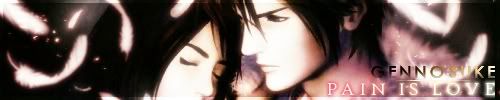
    Lol, gotta' love my speeches!

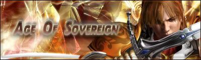
    Here's some new sigs:

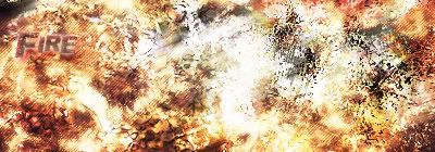
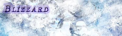
    These are just tags i've made, remember earlier on that i made these sigs representing elements, well, this is just the new versions lol:

    Fire and Ice


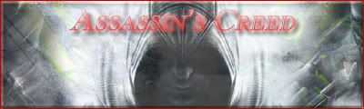
    Here's an assassin's creed sig:
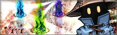


    And a vivi sig!:


    Enjoy! and please critique!

  2. #182
    I'm selling these fine leather jackets Aerith's Knight's Avatar
    Join Date
    Jul 2005
    Location
    The Netherlands
    Posts
    10,825
    Blog Entries
    1

    Default

    very nice.. i like the fire and ice ones

    say.. do you think you could give my avatar the same background color as my sig... cause i cant


  3. #183
    I'm Back~! Kanshisha's Avatar
    Join Date
    Dec 2006
    Location
    Australia
    Posts
    1,697

    Default

    I'll give it a shot, no problem

  4. #184
    Polaris's Avatar
    Join Date
    Apr 2004
    Location
    Sunny Portugal
    Posts
    6,186
    Blog Entries
    1

    Default

    Hm Funny when I see your sigs I really wanted to make a sig with you! Uhhhh this sounds tempting doesn't it? Just to see how good you are because you start with a really nice idea and you end up however not as good as you started. First of all there are too many brushes and too sharped! The colours are really well doned and the text as well. You should have made a border (like a flaming border )

    Another thing, never ever use a double border, it's lame <_< And it doesn't fit because if you alreasy have one why make another?

    So things you have to pay attention:
    - Moderate the use of brushes (do you know what you could use more? C4ds and fractal art search for PlanetRenders in Google and it's a wonderful webiste)
    - Use just one border

    On the Vivi sig you could have make it smaller (say 350*100) and instead of putting those things at the left, put it in the middle!
    Try new things! New ways of blending! ^^

    To finish! I gotta get jealous of your text! It's perfect!

    BTW I just found now a great tutorial with advices for an abstract sig:
    ***..x:X| A b s t r a c t Sig Tutorial |X:x..*** - Planet Renders Forums

    You might have to register to see the tut but trust me it's worthy ^^
    Last edited by Polaris; 01-08-2008 at 10:35 AM.

  5. #185
    I'm Back~! Kanshisha's Avatar
    Join Date
    Dec 2006
    Location
    Australia
    Posts
    1,697

    Default

    Oops, well, i amde these sigs before yuo posted so, which means that i haven't followed what you said in some of these 3 sigs.


    This one below i really like, it's simple but the text is really deep:


    Thanks! critique and comment

  6. #186
    Polaris's Avatar
    Join Date
    Apr 2004
    Location
    Sunny Portugal
    Posts
    6,186
    Blog Entries
    1

    Default

    Your first one is the best ^^

    Hm not so found of the one your using! You used the brushes everywhere. I know a technique to make a long text like that one but without standing as much as that! hihihi

  7. #187

    Default

    Seems youve almost mastered text use and your blending has improved a whole lot too! And youve been using good renders latley aswell

    Your Almost at the top!
    My thread http://forums.eyesonff.com/showthread.php?t=91051
    -3 time sigmaker challenge Winner


    Too tall. Maximum signature height is 250px. Please read the Signature rules and feel free to PM a mod/admin if you do not understand them. -Rantzien

  8. #188

    Post

    That Mario sig is awsome(Super Mario Galaxy is deffinatly game of 07) Squall your sigs are awsome, especially the Warhawk one you did for me, you should post that in here also

    Sig created by the Genius that is Polaris

  9. #189
    I'm Back~! Kanshisha's Avatar
    Join Date
    Dec 2006
    Location
    Australia
    Posts
    1,697

    Default

    Kind words, kind words.. I'll post up new sigs soon.

    And it's worth the wait ^.-!

  10. #190
    I'm Back~! Kanshisha's Avatar
    Join Date
    Dec 2006
    Location
    Australia
    Posts
    1,697

    Default

    Here!


    3 words to my self:
    NEED NEW FONTS

  11. #191
    I'm selling these fine leather jackets Aerith's Knight's Avatar
    Join Date
    Jul 2005
    Location
    The Netherlands
    Posts
    10,825
    Blog Entries
    1

    Default

    Its a little hard to read your sig, but it might be my resolution and the fact that i have glasses i never wear


  12. #192
    I'm Back~! Kanshisha's Avatar
    Join Date
    Dec 2006
    Location
    Australia
    Posts
    1,697

    Default

    It is a bit hard to read.. but, i need new fonts ><"! i b arely have any fonts that suit my current c4d's

  13. #193
    I'm Back~! Kanshisha's Avatar
    Join Date
    Dec 2006
    Location
    Australia
    Posts
    1,697

    Default

    Here's one:


    Just made it now, hope it's ok..

    Critiques and comments please

  14. #194
    I'm selling these fine leather jackets Aerith's Knight's Avatar
    Join Date
    Jul 2005
    Location
    The Netherlands
    Posts
    10,825
    Blog Entries
    1

    Default

    very nice.. i dont recognize the FF, but i only played half of them so what do i know. The colors are nice, but im not sure whats going on on the left side.

    overall, very nice


  15. #195

    Default

    hmm ive noticed that your latest sigs are becoming to look like mine except your wayy better with text and variety! Ive been surpassed!!
    My thread http://forums.eyesonff.com/showthread.php?t=91051
    -3 time sigmaker challenge Winner


    Too tall. Maximum signature height is 250px. Please read the Signature rules and feel free to PM a mod/admin if you do not understand them. -Rantzien

Posting Permissions

  • You may not post new threads
  • You may not post replies
  • You may not post attachments
  • You may not edit your posts
  •