the cloud one is really cool... although if you could just make the white around the sig disappear it would be perfect


the cloud one is really cool... although if you could just make the white around the sig disappear it would be perfect
=====>Check out my sigs!<=====

Thanks, i've been real busy with school lately but i'll try post a sig up soon, thanks for the support.
Okay~!!
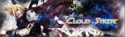
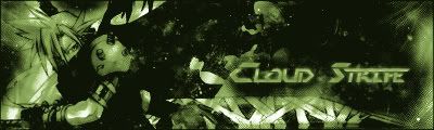
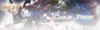
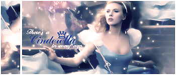
New sigs, i know it's been a while but here's come new sigs!
I Dled numerous diff fonts, so i'm not lacking of font styles no longer.
Worked my way with new styles for BG's and image usages. Enjoy.
These three are the same sig, but just different styles.
And this one is a sig without much focus on a certain thing or person what so ever, this sig was just me messing around with the BG.
Please comment and critique ^^! also please notify of suggestions for improvement or to make the sigs better, or even give me ideas! thank you.
I love the last one!
Agreed...should keep it simple.But I like the first one most.To me it's simpler and nicer..the 3rd one to me is too bright for some reasons..
想要對妳說的 不敢說的愛
Wow!! you are a talented person. Your transperant sigs have perfect edges, they are so adorable. I like your coloring as well and your blending and text. Keep it up!
Current goal: learning drawingNext goal: SQL coding
I agree with all your critiques.
@ XandrewX:
Yeah, the third cloud sig i made is bright... i forgot to lower the brightness.. and thanks for commenting once again.
@ Polaris:
Ok, i'll try more simpler text fonts than those complicated ones.. I agree, the last sig there is pleasent to the eye. thanks for your critiques.
@ White_dove15445:
Thanks for the kind words, but im still improving, learning many things still. thanks for your kind words once again.
Ok, i'll look for some more images and post more sigs up soon, thanks all
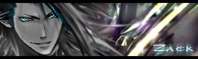
Here's a new one of Zack. in this sig, i focused more on bluring parts of the sig to make it look, well, good? haha, comment for yourself.
I highlighted the eyes more, causing it to look more.. piercing. I blurred everything but the face, which hopefully caused the face to stand out more.. thanks
Looks good much better than the fractals u used! I think you shouldn't focus too much on the head because it gives a weird look! Looks almost like a floating head which is bad, some people might like it but I hate it! Text rocks
I think it is pretty good except that you've blured his hair too and that the BG is too much blured, the eyes look like a nice touch but you shouldn't have over done the bluring 'cause the head now stands out much more than necessary. ^^
Current goal: learning drawingNext goal: SQL coding
Ah, i can see it now, thanks for pointing it out..
Yeah sure, I'll give blending a shot.. thanks for the comments and critiques too guys ^^
Next sig coming soon, just looking for pics XD
wow I love the new style, (not the Zack one but the ones before that)
the text was great I think and the style and effects were erally cool, and blended well with the render... although the first Cloud version is the best, second is a bit monotone and the third a biiiiiit too bright... first is
your current one is great as well! really cool!
Zack one could use some more work on colors and blending...
=====>Check out my sigs!<=====
Ok fellow sig makers and fellow EOFF forum participators.
I have some good news and some bad news.-
Bad news:
My photoshop 7.0 has just messed up and the cd is gone, so no more sig making for me...
Due to connections, a friend has burnt me a copy of CS2, proud to say again that im back on business, but a slight delay due to brushes and such being downloaded. Thank you for the patience and i'll try get to some sigs.
New sig!
This is me testing out the new CS2 i got. Whatcha' think?
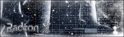
Looks nice and simple! Maybe the squares are too much but text is cool
 Posting Permissions


 Reply With Quote