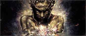
Well the 2nd one is kinda some badass ...it's nice...but I've seen someone use that render as a sig in this forum...from a request...anyway...it's nice but artisticly...1st one beat the rest...trust me..


Well the 2nd one is kinda some badass ...it's nice...but I've seen someone use that render as a sig in this forum...from a request...anyway...it's nice but artisticly...1st one beat the rest...trust me..
想要對妳說的 不敢說的愛

Both Are nice as usual Owen.
With the first one I don't much like the text In addition I am not a fan of the plainer backgrounds. But artistically speaking there really isn't any real issue, just personal preferances coming through.
The second much better fits what I like. Nice Script like text and the background is more complicated. Not much to complain about only real issue I see with it is the background in the top left corner. It feels sorta out of place to me. But meh, that only occured after I stared at it a bit.

STILL Updating the anime list. . . I didn't think I was that much of an anime freak! I don't even want to consider updating the manga list!

Thanks alot guys.I am trying to make my work better but meh, text always stays bad. lol
two new sigs, not as good as my latests but good enough to be posted.

This was the first happy coloured sig I made ever.
Back to my black thoughts.
Opinions are welcome!.
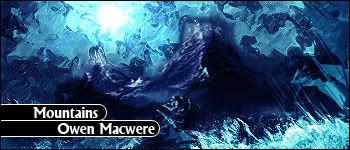
The first one isn't that great. The background doesn't match well. The picture is way too with some rough edges. The text is unimaginatively placed and its not even a great font. I don't like it at all.
The second one isn't much better. It reminds me nothing of mountains. It looks like water or something. The way the text is placed isn't great either. You could have at least made the little button-like things transparent. The border isn't great either.
I would have to aggree with Genji on the first one's background. I'll stay away from text commenting since my sight is so awful right now that all I really see are blurs anyways.
As for the second one I do get the feel of mountians from it(or rather a mountain but close enough). Though I would aggree with genji's suggestion on making the bars that the text is on partiually transparaent.
Overall they look nice but aren't as good as many of your others.
STILL Updating the anime list. . . I didn't think I was that much of an anime freak! I don't even want to consider updating the manga list!
the day genji gives you a good comment on your sigs would be (SPOILER)end of the world
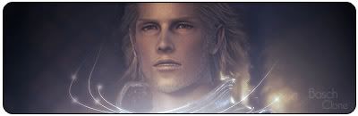
the first one is okay and i really like the colors but the text seems out of place. It's as if you jammed it into that tight space but the warm coloring looks really good.
These weren't my best sigs. Here's a one I made without using any brush, and thanks Atleanty and Shun for the comments
Whatcha think?.
PS to genji: Please don't bother yourself and come here again, I can't see your posts.
Last edited by Owen Macwere; 11-25-2006 at 07:42 PM.
It's nice...but it has it's weakness too...but overall..other than you overdo the effects...it's really nice...the text blends well with the BG too
想要對妳說的 不敢說的愛
The text is hard to see. Again, its pretty cliche'. I don't like the render at all. I just don't like it. The size isn't the best either.
You must be blind or something...
想要對妳說的 不敢說的愛
No, I'm just not a wild fanboy groupie like everyone else in this thread. I don't like his sigs. I don't have to like his "wonderful, perfect" sigs.Originally Posted by XandrewX

EDIT: And it also seems like I'm the only one who gives him constructive criticism. I point out the bad things so maybe he can improve.
Sorry to chat in a place like this Owen but this is going to be my final reply..for genji
yeah every sig has it's own weakness I agree...but you're just being so negative about it...it's so obvious that the text is readable let alone the size,the size of the sig is choosen by it's creator that's not a point to be debate of,other than that I'm not a fanboy of sigs either but you got to give people credit when the time is right and not keep condeming people's sig...
What do you think you're?It's true but honestly almost everyone who comment on your sig looks so fanboy like too think of it.No offence intended.
想要對妳說的 不敢說的愛
I disagree with you.
Owen, the text is somewhat hard to see, the border of the font is black, and the background is dark. The effects are cool though.
I disagree. Anything that the author posts is subject to discussion and criticism. When you post something, you open yourself up to criticism. And yes, the size IS open for debate.

whoa now, no need to start a stupid flamewar, So Genji doesnt like the sigs, its his opinion, just likes its urs to like them Andrew. And Genji is right cause Owen posts the sigs expecting to get feedback, and hes bound to get negative feedback and its his option to take it or leave it.
And on his latest one the text is a bit hard to see, dont try to do too many things to your text, keep the font and effects on it simple. The border personally i dont like either, but thats just me. But other then the text its a good sig.
Made by me
 Posting Permissions