Critique is welcome.
Thanks


Critique is welcome.
Thanks


Those are really good, your style is great!But on the third one, the text is hard to read.
Apart from that, Great work! ^_____^
♥
Uhhh I like the first one! Reminds me blood...Seriously it does!
The last one is very cute as well!
I like the 2nd and the 3rd one...the first one...the few brushes or stains there isn't too good...without it the sig will be nice...just opinion.
想要對妳說的 不敢說的愛
hehe Thank you guys ^^
In the first one, it's a texture in overlay "mode", I thought it was quite dark too but I wanted to do a different thing ^^
In the second one, I thought it was missing something but I don't know what...
I used the text in the 3rd one as overlay too because I wanted it to "melt" in the texture, but I didn't add a border to the text, so it looks kind of confused, I agree.
Thank you for all the opinions.

First one is my favorite. Try messing with the curves to make it a bit brighter
Made by me
Thank you,
here's some more:


Hmmm... your sigs are very cool!!. I like the way you make them not crowded yet so ncie looking and original. in your new set I'd say that first one look kinda plain, but text is nice. Second, needs a bit more blending but as well your text is good. Third and fourth, I like this one, very nice work you did there.
Your text amazes me, it is better than I ahve ever did or seen.

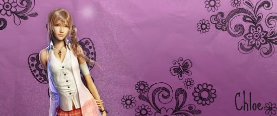
1st Sig - Very well done, you used that effect really well and nice placement of the image. The text suits it.
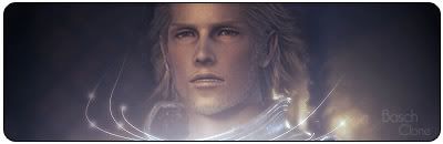
2nd Sig - The simple background and image go well together, although I'm not too sure about the text used.
3rd sig - It's really sweet and I love the background and images.
Thats all to say really. You seem like a good Sig maker/graphics person, and you'll surely improve.
Thank you so much, Owen and Raebus, I am glad you guys liked
It's good sigs man...I mean..I always wanted to make sigs like that...I wasn't able...so...idiot me...anyway your's are great I really admire sigs like those.
想要對妳說的 不敢說的愛
That's sweet Andrew, thank you ^^ I'm sure you can do better than I.
Here goes more:

The last one is great! Really good
Thanks for saying that but fact it seems not many people care about my sig making thread -_- anyway back to business...
Erm...honestly the 3rd one is nice because of the animation.That's my opinion...and the 1st and 2nd one...I like the layer that have lines to cover the base layer of the sig...I can't do that in GIMP as I really admire it.But uh...this time...to me the 2nd sig...that effect or whatever you call it...i think you've over done it...Oh...and the text...I some of your sigs using the text that are in the 2nd and 3rd sig...so umm...kinda common and I think you should use new ones
想要對妳說的 不敢說的愛
I use PS and haven't used GIMP yet, it doesn't use layers?Originally Posted by XandrewX

haha you're so rightOh...and the text...I some of your sigs using the text that are in the 2nd and 3rd sig...so umm...kinda common and I think you should use new ones
I am not very inspired for writting cool things, at the moment.
You mean the effects or the font?although yupe...the text are nice.Where do you download it from?
If you mean the font, it is a pixeled one, I use it when I want to put text in...well..small things, name of the font: Ernest.
You can download that and much more at http://dafont.com
 Posting Permissions


 Reply With Quote