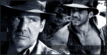
I love the effect you put around the text!Originally Posted by Roto13

Amazing!
(SPOILER)Photoshop looks really hard to work with

I love the effect you put around the text!
(SPOILER)Photoshop looks really hard to work with


It's not so hard if you bug Genji to teach you stuff.
wow I'm gonna take the shoot and say this is ur best!
(SPOILER)Owen taught me GIMP even though I had a great teacher that didn't make me a good banner maker

Roto, you did an amazing job. You keep improving, and I'll keep recommending you to my referrals.
Leave some shards under the belly
Lay some grease inside my hand
It's a sentimental jury
And the makings of a good plan
Well, it also takes practice and experimenting on your own. Keep trying. If you take a look at the first post in the topic, you can see my gradual progression from crappy to not crappy. :P
Wow, I thought this was going to be another snarky comment. ;) I'm honoured.
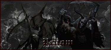
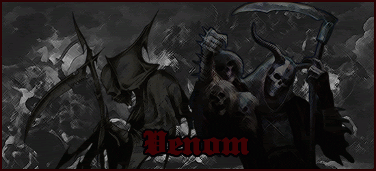
I made two versions of this Death sig for Venom. I wasn't sure if the first one was too dark or not.
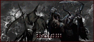
If the text wasn't too dark!Really good!

:D?
Uber.
Leave some shards under the belly
Lay some grease inside my hand
It's a sentimental jury
And the makings of a good plan
This one didn't turn out as I had hoped. :P
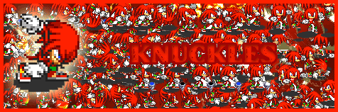
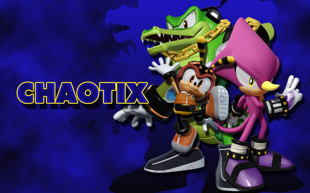
On another note, I made this wallpaper earlier today and I don't think it needs it's own thread. ;P (clicky to enlargey)

Last edited by Roto13; 03-21-2007 at 12:29 AM.
The red one is so cute!


lol, Roto. I like this wallpaper. Gotta use it. keep at it, mate. ;]
The Knuckles one actually has 25 layers. xD But it didn't turn out too well. It's too busy and everything. Maybe if I blurred the background a little....
I'm actually proud of that wallpaper. :D I think I might practice making those instead of sigs from now on. I have a lot more room to experiment and learn with something so big. Glad you like it.
The biggest gripe I tend to have with your sigs are your borders on average. Either I think the color clashes a bit much or else I think it is too thick.
And I concur with your assesment on the Knuckles one. It is too busy and blurry might help.
The background is a bit.... well simple I guess is the best way to put it. However, simple itself doesn't make it bad it just makes it so it doesn't stand out as much in my mind. Maybe try a more complicated background next time.

STILL Updating the anime list. . . I didn't think I was that much of an anime freak! I don't even want to consider updating the manga list!
Yeah, the Knuckles sig is a write off. ;P I deleted the PSD right after I made the sig, so I suppose it's a lost cause. No big loss.
Blargh, I had complicated wallpapers. I couldn't even find my recycle bin when I was using the Eyeson avatar wallpaper. xD
I BANISH DIRT TO THE LAND OF WIND AND GHOSTS!
 Posting Permissions


 Reply With Quote