I like the first, nice BG. The red one is nice two but bit plain. Nice work on the .gif formate one.


I like the first, nice BG. The red one is nice two but bit plain. Nice work on the .gif formate one.
It is like my birthday come early!! More sigs!!
I absolutely love the first sig with the Bleach...the background is amazing and I could go on forever about how much I like that but I will spare you of that (lucky you then haha) And I like how you changed the edges in the second one...really really cool!! Also, the writing on that sig is really good. You did an amazing job on this!!
The second one is really good too. I like the background on this one too...it looks complex in a way and I like it a lot
You never fail to amaze me with your sigs!! Keep it up!
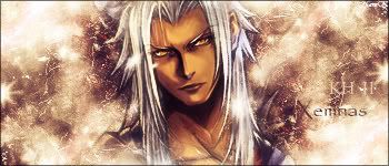
Sig was made XandrewX, of course
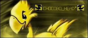
Chocobo Lovers Club!!
Proud Member...all hail Goldenboko!
Would you like to play? Paste this into your sig with a link to your favorite Playin' and Support the Playin' threads.
who didnt want it!?!? its awsome my fav so far!Originally Posted by XandrewX


My thread
-3 time sigmaker challenge Winner
Too tall. Maximum signature height is 250px. Please read the Signature rules and feel free to PM a mod/admin if you do not understand them. -Rantzien
I've made a few new sigs so far.I want to say thanks to the people who commented on my sigs so far.Really thanks and I'm greatful about it.Here are the few ones so far.
1.
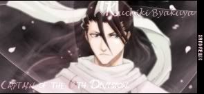
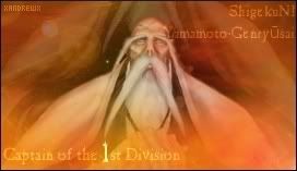
Another bleach sig captain of the 6th Division Byakuya.
2.
This is another one of the many request sigs.He/she didn't take it so again I decided to post it here and have you all kindly give some comments on it.
3.
I'm trying out a new style.It looks kinda and really sucks.
Anyway,here are the few which I've tried to make so far.I wanted to wish thanks to the people who've commented on my sigs so far and thanks in advance to the people who are commenting on this thread.
想要對妳說的 不敢說的愛
they're awesome, i like the new style also...
it's not bad at all, and the sig is really good, unique...
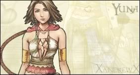
and i can't believe that they didn't take the yuna sig it's really nice and the way you can see yuna in the bg is very nice...
great work!
=====>Check out my sigs!<=====

Hmm... Actually I kinda like it. I just think you stretched your luck kinda thin by making it quite that long(maybe 400 pixels instead of 555 pixels[i.e. crop off the bit past the shoulder strap that the text starts on]) and by adding that other bit of text(the "I'll keep a part of you....). That bit of text is a bit too hard to read for how long the phrase is. Also it doesn't mesh well with the rest of the sig.

STILL Updating the anime list. . . I didn't think I was that much of an anime freak! I don't even want to consider updating the manga list!
What a birthday present
I love the first one...I like the way it is blended and how you made that scarf look...it looks magical! Awesome job on that one!
And who in their right mind would reject this sig? I mean, it is one the best ones of Yuna that I have seen. I love that it is the top half of Yuna in the front while the bottom half is in the background faded...I loved that effect and I was just in awe. Amazing, XandrewX...just amazing
Well...I dont think that the third one sucks
Love them all!! Keep it up!
Sig was made XandrewX, of course
Chocobo Lovers Club!!
Proud Member
Would you like to play? Paste this into your sig with a link to your favorite Playin' and Support the Playin' threads.
Yes, the Yuna one is very good, and the last one too, maybe just a bit long that's all. Anyway, keep at it.
Yeah they're all good... maybe you should have reduce to 500* instead of 552*It'd be better but still long!
Thanks guys,Chocobo_head*,Owen,IceAngel thanks to shun and tim too =).Well here are some new ones...not interesting I guess..
1.
A lame sig which Owen know why xD
2.
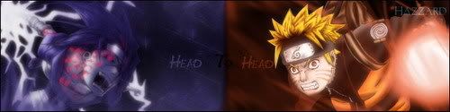
A sig request from Hazzard.Comments?
3.
Ya...it looks kinda lame..I intend to make it looks like flame..maybe just failed.
Well here's it...enjoy.Ya,these sigs are maybe uninteresting...anyway enjoy commenting...I again wants to thank the people who've commented my sigs and also thanks in advance for those who are commenting on my sigs.Arrigato Gosaimasu...is it? ^^'
Last edited by XandrewX; 04-02-2007 at 06:18 PM.
想要對妳說的 不敢說的愛
the first sig is simple and a bit dull/foggy to look at. Maybe if you brought out the render more by making it brighter or more vivid, it'll look better.
the second sig is a little too long and the middle where you split the two sections is too sudden. Maybe blending it a little more would be better. Also, try sharpening the renders, it gives a good focus.
Last one, again is a little too dull. Try brightening the render more or sharpen it. Then, duplicate the render about two times and set one to screen/color burn (depends on the render) and then the other to overlay/ Soft light (depends on the colors of render as well)
i really like the second one, with the contrast between the two sides, and the third one has some nice coloring and the blending is also great with the same person in the bg except bigger.
and the first one was your entry in the sig contest i see...
(oh and as a more insignificant note, the "To" in hazzards request should have been in white, or at least a bright color, had i not known it was there before, i wouldn't have seen it at all...)
=====>Check out my sigs!<=====
Er,are you thinking that I'm using PS...?I'm using GiMP,and yeah I'm still learning,but if you think that you can do better than these with GiMP then wow you're good.=).Just want to say that I'm using GiMP not PS.
About the 'Hazzard'..I just want it to blend in to the sig more...haha...it think it's over blend and became camouflage xD
想要對妳說的 不敢說的愛
all the things i've said are present in GIMP maybe just different names but those options are still available in GIMP. GIMP is like an imitation of photoshop except it's free.
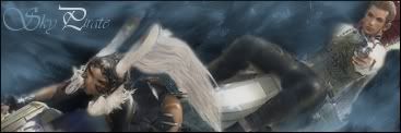
OMG I love the sky pirate one with fran and balthier...
My sig and avy are made by me.
 Posting Permissions


 Reply With Quote