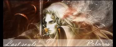
haha, my city's name is also my nickname shortened XD
oh yeah, you said your text were pixelly earlier... they don't look pixelly at all.


haha, my city's name is also my nickname shortened XD
oh yeah, you said your text were pixelly earlier... they don't look pixelly at all.
What do u think? Be honest!Lant I wish I had PS too... Once Owen tried to put PS on my 4shared but he couldn't!
Last edited by Polaris; 07-11-2007 at 06:09 PM.
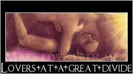
I think this sig is really clean and great looking. There are no JPEG artifacts. The only problem is text, cursive (vladmir?) doesn't look too good for complete texts. Maybe if you used cursive on the first letter of the word, it might look better.
you mean it wouldn't install? do you think maybe your computer specs aren't good enough or maybe it's not meant to be installed on 4shares?
Ok! I made a new one with .png

yeah, png quality is just super. For jpg, what quality do you save it as?
I usually save in quality 100 other times 90, it depends! Sometimes 100 is too big for eoff limit size!
yeah! i hate the size limit! well, 90 is really high already so it shouldn't have those jpeg artifacts. Do you think it was because your stocks were bad quality? because only a small percentage of your sigs have those artifacts.

This one is your best. woowOriginally Posted by Polaris


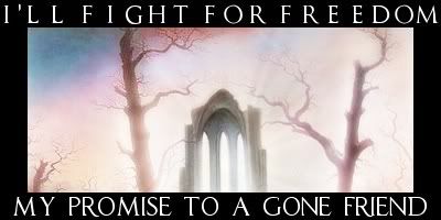
Change the font for "invincible" to match the "Together we're". Plus, maybe change the positions of the stars - it looks very flimsy in we'r
Perhaps
would look better...
EDIT: Without the annoying gap in "invincible".
Money, power, sex... and elephants.
-- Capt. Simon Illyan, ImpSec
New ones! I followed your advice Odaisé
I made two new ones

Yes, that's much much better! Excellent work, all of them!
Now, I understand if you hate me for saying this, but...
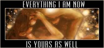
It's spelt "Promise".
Money, power, sex... and elephants.
-- Capt. Simon Illyan, ImpSec
OMG!I made a mistake! *dies* Good thing about making text on a border: you can erase it and spell it right
Fixed!
Thanks ^^" Thank you so much! I like when people see mistakes and tell them! Like that I can fix it!

Er...is broad borders in fashion now..?I'm really curious though..I would like to try if the chance do come...anyway...Other than the wide border that kinda makes me feel kinda weird about..others are great..I dunno how you do that 2nd sig..but the effects are nice..just the Leviathan's is a little bright..it's even brighter when you use a broad white border..just my opinion..Good Luck.
想要對妳說的 不敢說的愛
Now it's perfect!
Money, power, sex... and elephants.
-- Capt. Simon Illyan, ImpSec
 Posting Permissions