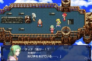
Screens like these didn't help matters.
What have they done!? said pretty much every single person who grew up with the original on the SNES. The new, more 'cartoony' art style for the remaster was met under a firestorm of criticism, mainly for the rendering of the character sprites and how much they clash with the redrawn backgrounds, character portraits, enemies and Espers. If that wasn't bad enough the game was released with a variety of bugs, one going as far as to break the entire game before you could finish it. As if the game became self-aware of its current state and performed seppuku. Fortunately, Square Enix has already addressed these issues in a recent update upon release of the iOS port, leaving the art style as the main reason many won't give this remaster a chance.
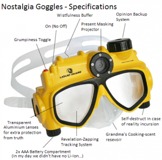
Available at your local shop for 500 gils
There's nothing wrong with taking a trip down memory lane, we here at EoFF and people all around the world have done it. It's a natural part of life to look back on those fond childhood memories and smile, but it's when we let those perceived notions of the past cloud our judgment that the present seems to look decreasingly worse, and the past increasingly better, than it really is. So we ask, just this once, that you take off the goggles and judge the following images on their own merits.
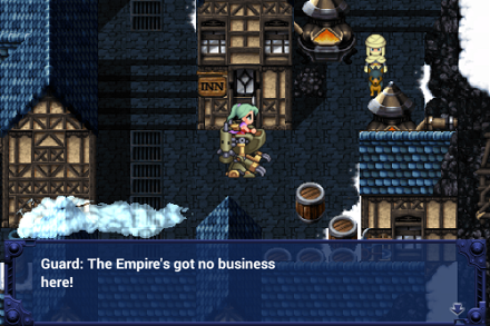
Terra ♥
Okay, now this doesn't look so bad. The street, barrels and houses in the background are all drawn well, Terra and the guard sprites are nice and clear and easy to spot and the text screen also looks nice with words that are easy to read.
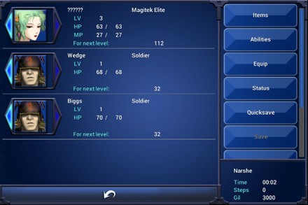
Here we have the character screen highlighting the members of the party, their stats and our menu selections on the right. Wedge and Biggs have got that, We're the Empire! look going for them and Terra appears as, well, a girl brainwashed to serve the Empire. If that was the look they were going for they nailed it. It doesn't make any sense for the rest of the game, but they nailed it. The texture on the menus and the scroll bar are simple. Nothing wrong with simple, some times less is more and more is less, but we weren't expecting anything extraordinary on this part anyway.
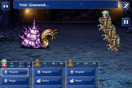
Why does it look like Wedge and Biggs have the breasts that should have been given to Terra? These are obviously meant to be the pecs on their armor, but it looks like they drew them a tad bit too round to the point they look like man boobs. The side view is still okay and that monster looks awesome with the attention to detail and the black outlines around it. Is that a pause and fast forward button on the top left and right of the screen alongside a bathroom like image of a man running? The icons down at the bottom there on your battle commands at least fit the RPG elements, the rest they probably could have done without. They just stick out too much.
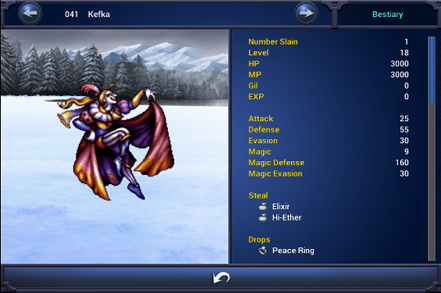
Kefka in all his glory!
Once again the enemies and backgrounds in the remaster continue to prove to be the best part. Kefka looks great in this image, everything from the details on his face, hair, makeup and clothes does the Jester of Chaos credit and those mountains and trees back there are simply beautiful. The rest on the technical side is exactly how they should be, though the yellow on the blue background just looks ugly. A pale shade of blue would have gone with the BG color a lot better, provided it was something that could change along with the BG.
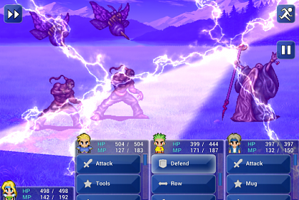
Stop! Esper time!
One of the many summons in the game doing what they do best, kicking monster booty! The Espers are drawn in the same style as the monsters in the game and the special effect coming from this one's attack just looks cool, and this is only a still image of it. Imagine the full animation from actually playing the game. We get to see more of the attack commands too, a basic sword and shield icon for attack and defend, a star with tools and mug and the double arrow next to row. They all look okay except for the star, but even that isn't as distracting as the icons at the top.
Conclusion: While it may take some adjusting for those who grew up with the original game on the SNES, Final Fantasy VI Remaster is hardly a disservice to the game and despite what you may think of the art, it's still the same game underneath. The same story and characters that an entire generation of gamers fell in love with. Should it have been updated in such a way? That's a discussion for another day, but if it manages to draw in a new crowd of gamers who can play it on the go whom otherwise may not have sat down to try it, then is it really so bad?
Sources
Google Images
Kotaku
EoFF user: Flying Mullet


vBulletin Message